Inconsistent branding costs companies up to 23% in revenue annually. When your design, messaging, and tone vary across touchpoints, potential customers lose trust before they even read your pitch.
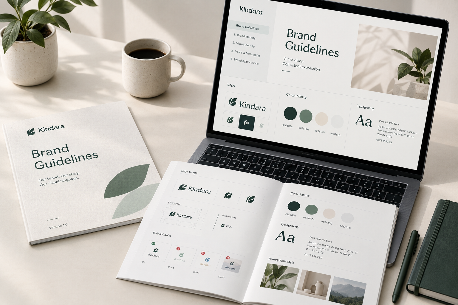
A comprehensive brand style guide solves this problem. It acts as the single source of truth for your internal team, external agencies, and freelancers, ensuring every piece of content aligns with your brand standards.
This guide breaks down exactly what a brand guideline should include, covering the essential elements, practical examples, and a step-by-step checklist to build your own seamlessly.
The Core Blueprint: What Should a Brand Guideline Include?
A robust brand style guide bridges the gap between creative strategy and everyday execution. To build a guide that teams actually use, structure it around four primary pillars:
- Brand Identity
- Visual Identity
- Voice & Messaging
- Channel Execution
1. Brand Story & Identity Foundations
Before diving into logos and hex codes, set the strategic context. Teams need to understand why the brand exists to represent it accurately.
Mission, Vision, and Core Values
- Mission Statement: Explain what your business does, who it serves, and how it delivers value today.
- Vision Statement: Define the long-term impact your organization aims to achieve.
- Core Values: Outline 3 to 5 guiding principles that shape internal culture and public representation.
Target Audience & Buyer Personas
Include brief summaries of your core audience segments. Outline their pain points, goals, and demographic profiles so writers and designers can tailor visuals and copy directly to them.
2. Visual Brand Standards
The visual section forms the core of your brand standards. It prevents misinterpretation and maintains visual integrity across print and digital media.
Logo Usage Rules
Your logo is your primary visual identifier. Provide explicit instructions on how to display it correctly across all formats.
- Primary Logo: Define the main version used for standard applications.
- Secondary Logos & Marks: Show acceptable variations, such as stacked layouts, wordmarks, or standalone brand icons.
- Clear Space & Minimum Size: Specify the required padding around the logo to prevent crowding, along with the smallest allowable dimensions for print and screen.
- Misuse Examples: Show explicit “don’ts”—such as stretching, changing colors, applying drop shadows, or placing the logo on low-contrast backgrounds.
Color Palette Specifications
List exact color codes across all medium standards to ensure consistency across digital displays and professional print.
| Color Role | Primary Use Case | HEX (Web) | RGB (Screen) | CMYK (Print) | Pantone (Spot Color) |
| Primary | Headers, main buttons, logo | #0F2C59 |
15, 44, 89 |
100, 85, 30, 20 |
281 C |
| Secondary | Supporting accents, cards | #40A2E3 |
64, 162, 227 |
70, 25, 0, 0 |
299 C |
| Accent | CTAs, highlights, badges | #F875AA |
248, 117, 170 |
0, 65, 15, 0 |
231 C |
| Neutral Dark | Body copy, dark backgrounds | #1E1E1E |
30, 30, 30 |
0, 0, 0, 90 |
Neutral Black |
| Neutral Light | Backgrounds, borders, cards | #F5F5F7 |
245, 245, 247 |
2, 2, 0, 3 |
Cool Gray 1 C |
Typography Guidelines
Establish a clear typographic hierarchy to maintain readability and visual balance across landing pages, ads, and documents.
- Primary Font: Designated for main headlines (H1, H2).
- Secondary Font: Used for body text, subheadings, and lists.
- System/Fallback Fonts: Web-safe alternatives (e.g., Arial, Georgia) when custom fonts fail to render.
- Type Hierarchy Rules: Define font weights, line heights, letter spacing, and sizing rules for desktop and mobile layouts.
Imagery & Media Style
Define the visual aesthetic for photos, illustrations, and graphic assets.
- Photography Style: Specify tone, lighting, subjects, and framing (e.g., authentic, high-contrast, candid vs. studio).
- Iconography & Graphics: Document icon stroke weights, corner radius styles, and approved illustration libraries.
3. Brand Voice, Tone & Messaging
Visuals capture attention, but voice builds relationships. Document your brand’s verbal identity to maintain consistency across copywriters and platforms.
Voice Pillars & Tone Attributes
Select 3 to 4 character traits that describe how your brand sounds. Pair each trait with actionable guidelines.
Example:
- Trait: Authoritative yet approachable.
- Do: Use clear, precise terminology backed by data.
- Don’t: Rely on obscure industry jargon or condescending language.
Writing Style Guidelines
Cover practical grammar and formatting preferences to align content creators quickly:
- Preferred formatting (oxford commas, title case vs. sentence case for headings)
- Terms to use vs. terms to avoid (e.g., “customers” vs. “users”)
- Approach to industry-specific terminology and technical jargon
4. Digital & Channel-Specific Execution Guidelines
Modern brand guidelines must account for touchpoint-specific execution. Extend your core identity rules to address channel constraints:
- Social Media: Avatar specifications, story templates, video cover rules, and platform-specific tone adjustments.
- Email Marketing: Header dimensions, button styles, footer disclosure requirements, and plain-text fallback rules.
- Physical & Merchandise: Print bleed requirements, packaging rules, sign specifications, and apparel placement guidelines.
Comprehensive Brand Guidelines Checklist
Use this interactive checklist to review your existing style guide or assemble a new one from scratch.
Phase 1: Strategic Core
[ ] Mission and vision statements clearly articulated
[ ] Core values defined with practical context
[ ] Primary buyer personas and target market outlined
Phase 2: Visual System
[ ] Primary, secondary, and mark logo variations included
[ ] Logo clear space and minimum sizing rules defined
[ ] Visual examples of logo misuse provided
[ ] Primary, secondary, and accent color codes listed (HEX, RGB, CMYK, Pantone)
[ ] Primary, secondary, and fallback fonts specified
[ ] Typography scale and hierarchy rules documented
[ ] Photography and iconography guidelines established
Phase 3: Verbal Identity
[ ] Core brand voice traits defined with “Do / Don’t” examples
[ ] Preferred grammar rules and style preferences documented
[ ] Approved product names and industry terminology listed
Phase 4: Distribution & Governance
[ ] High-resolution logo files and font assets packaged for download
[ ] Digital and print execution rules established
[ ] Primary point of contact for brand approvals identified
How to Create and Distribute Your Brand Guidelines
Creating brand standards is only half the battle—your team must actively use them.
- Keep It Accessible: Store your brand style guide in a centralized, cloud-based platform (like a live web page or shared drive) rather than a static PDF that becomes outdated quickly.
- Provide Downloadable Assets: Embed direct links to vector logo files (.EPS, .SVG), font files, slide templates, and graphic packages.
- Appoint a Brand Manager: Assign a team member to answer questions, review non-standard executions, and update guidelines as the brand evolves.
Key Takeaways
A well-structured brand style guide protects your visual identity, speeds up content creation, and builds long-term customer trust. Start by defining your core brand story, establish clear logo and color specifications, document your tone of voice, and keep assets easily accessible to your team.