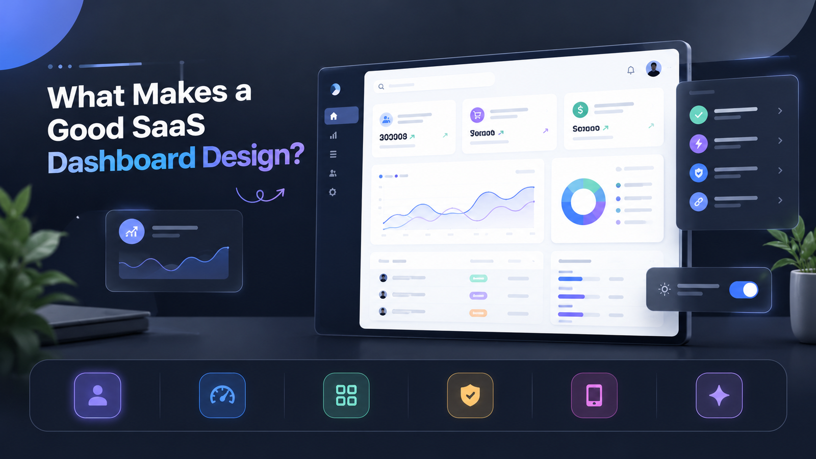
Users log into your software, stare at a wall of chaotic data, and churn within weeks. That retention killer usually stems from a convoluted interface rather than weak core features. Understanding what makes a good SaaS dashboard design bridges the gap between raw software capabilities and sticky, long-term user engagement.
This comprehensive guide breaks down the proven UX frameworks, layout strategies, and data visualization rules that elevate average software into an indispensable tool.
The Core Pillars of Modern Dashboard Design
A high-performing interface goes beyond aesthetic appeal. It acts as a command center that empowers users to make fast, informed decisions without friction.
1. Ruthless Information Hierarchy
Users should grasp their primary performance metrics within three seconds of landing on the screen. Place key performance indicators (KPIs) at the top left where natural reading patterns begin. Secondary charts and drill-down tables belong further down or tucked into secondary tabs.
2. Radical Reduction of Visual Clutter
White space is not wasted space; it is a critical design element that prevents cognitive overload. Limit color palettes to one dominant brand color and one high-contrast accent color for actionable alerts. Strip away heavy gridlines and decorative borders that distract from core data points.
3. Action-Oriented Interactivity
Every data point should lead to a logical next step. Great dashboard design incorporates inline filters, date range pickers, and direct action buttons right next to metrics. Users should never have to navigate to a separate page just to resolve an alert shown on their home screen.
What Makes a Good SaaS Dashboard Design? Essential UX Frameworks
Building a sticky SaaS product requires balancing macro-level visibility with micro-level control. When evaluating what makes a good SaaS dashboard design, product teams must weigh contextual relevance against static templates.
| Design Element | Poor Implementation | High-Converting Best Practice |
|---|---|---|
| Metric Selection | Displaying every available metric at once. | Curating 4 to 6 core metrics aligned with specific user goals. |
| Data Loading | Blank screens or frozen UI during data syncs. | Skeleton loaders and subtle progress bars for perceived speed. |
| Customization | Rigid, one-size-fits-all layouts. | Modular widgets that users can drag, drop, and toggle. |
| Responsiveness | Broken grids and hidden tables on smaller laptops. | Fluid, mobile-optimized layouts with collapsible sidebars. |
Best Practices for High-Converting Data Visualization
Data visualization can make or break your user experience. Choosing the wrong chart type forces users to decode information instead of digesting it instantly.
-
Match Chart Types to Data: Use line charts for trends over time, bar charts for discrete comparisons, and donut charts for part-to-whole ratios with fewer than five categories.
-
Maintain Visual Consistency: Keep axis labels, tooltips, and font sizes uniform across all reporting widgets to build immediate visual trust.
-
Implement Smart Defaults: Do not present empty states to new users. Provide pre-loaded demo data or clear onboarding tooltips explaining what each widget represents.
Conclusion
Mastering what makes a good SaaS dashboard design requires a relentless focus on user intent, structural clarity, and purposeful simplicity. By prioritizing information hierarchy, reducing visual noise, and offering modular customization, you transform complex analytics into a delightful user experience. Implement these frameworks today to drive higher user engagement and long-term retention.
Frequently Asked Questions
What is the golden rule of SaaS dashboard design?
The golden rule is clarity over complexity. Your interface should answer the user’s most critical questions immediately without requiring them to hunt for data.
How many metrics should be displayed on a primary dashboard?
Aim for a maximum of 4 to 6 primary KPIs on the main view. Overloading the screen dilutes focus and causes cognitive fatigue.
Should a SaaS dashboard use a dark or light theme?
It depends on your user base and use case. Light themes work best for data-heavy productivity tools used during daytime hours, while dark themes excel in developer tools, media apps, and monitoring dashboards viewed in low-light environments.