Product UX
Goooo
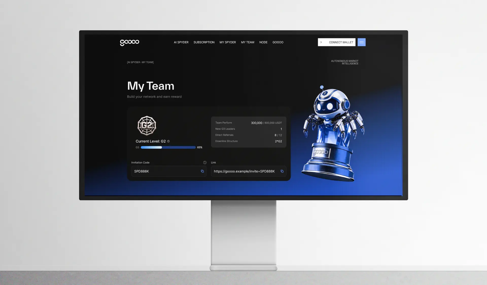
Operations dashboard redesigned around the daily workflow, reducing clicks on the tasks teams repeat most.
The challenge
Features had been added for two years without a structure behind them. The most frequent task took six screens to complete.
Our approach
We mapped the real workday, cut what nobody opened, and rebuilt navigation around three recurring jobs. Density was tuned so power users see more without feeling crowded.
The outcome
A calmer product surface where the daily loop happens on a single screen, backed by components the team can reuse.
What we shipped
- /Primary workflow reduced from six screens to one
- /Information density tuned for all-day use
- /Component library documented for engineering handoff
Services
- Product UX
- UI design
- Design system
Deliverables
- Flow maps
- Dashboard UI
- Component library
More work